
Viva o presente com o BB — Campaign Concept Case Study
Banco do Brasil × Mercado Livre · Anniversary partnership (concept proposal)
Brief overview: Banco do Brasil asked for a campaign concept to run in partnership with Mercado Livre, tied to the bank's anniversary. Nothing was defined yet — no creative territory, no key visual, no look. The starting point was a single business goal: get BB cardholders to pay with their BB Visa cards inside Mercado Livre.
The challenge
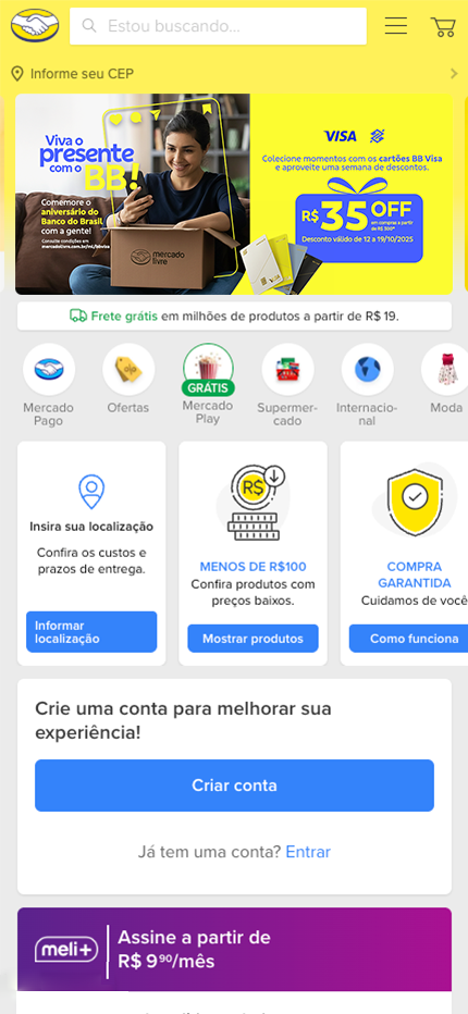
Banks tend to talk about themselves the way banks do — rates, benefits, fine print. The hard part wasn't communicating the offer (R$35 off on purchases over R$300, for one week). It made Banco do Brasil feel like a natural part of everyday moments rather than a sponsor stapled onto someone else's platform. The concept had to do two jobs at once: feel warm and human, and still land a clear, transactional discount.


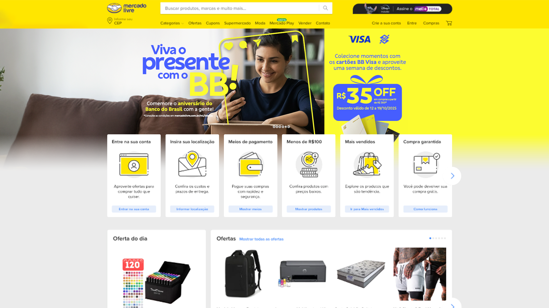
My role: This was a team project. I led the visual concept — art direction and the key visual — while the copy was written by a teammate. I defined the mood, the scene, the color system, and the way the two brands (plus Visa) share the same frame. The imagery was built with generative tools, which let me compose the exact moment and atmosphere I wanted without a photoshoot.
The idea: The campaign line — "Viva o presente com o BB", written by our copywriter — plays on a double meaning in Portuguese: presente is both "gift" and "the present moment." The visual leans into that: comfort, home, presence, closeness. So instead of a product-first layout, the concept centers on a real-feeling domestic scene — someone relaxed on the couch at home, opening a Mercado Livre box. It's the moment everyone recognizes: the package finally arrived. The message underneath is simple — this is your everyday life, and with BB it just comes with more.
A few deliberate decisions:
1. Warm, lived-in setting to carry the "home / closeness" feeling, instead of a studio or product shot.
2. Floating social frame (like, comment, share, save) connecting the cozy offline moment to the digital shopping behavior the campaign is actually about.
3. Hard color split — the lifestyle scene on the left, a bold yellow offer block on the right — so the emotional story and the transactional offer each get their own space without competing.
4. Co-branding as a partnership of equals — Mercado Livre yellow, BB blue, and Visa sharing one consistent visual language.
Honest note on results: This was a proposal. Nothing went live, so there are no metrics — reach, coupon redemptions, or sales lift — to claim. What this case shows is the strategic and visual thinking behind the concept, not its market performance. Takeaway: The interesting constraint here was tone. A discount campaign usually shouts; this one needed to feel close and calm while staying unmistakably about an offer. The concept solves that by separating the two — emotion and mechanic — and letting a single, familiar home moment carry the brand message.